DragonsWeb

Welcome to my blog. Please take a look around and enjoy yourself. I hope my work will give you pleasure and inspiration, but please be kind and don't use any of it as your own.

When you have looked, why not leave me a comment, as I value what followers and visitors have to say.


Then pop over to DragonsDream Tag It On and DragonsDarkerSide
Showing posts with label The StampMan challenge. Show all posts

Friday, 15 June 2012

Stampman Design Team - Lead Week

Hi Readers... back on Firefox to upload my pics... what a pain blogger is at times eh?? But at least it puts me back in business.

So today, it's my turn to lead the Stampman Challenge blog DT for the next game.. The theme Jill chose for me was Time or Travel - well, right up my street eh?? So thanks Jill!!
 I decided to have a TH car as the focalpoint of my piece, which is 8x8...  I also used tickets and metal pieces of idea-ology.
 This is shot of the whole piece. Tickets, vintage photos, images of cars and related memorabilia...
 I made a compass and popped it on a chain with a threepenny bit charm.. There is a sun charm at each top corner.
 The all-important clock, to tell what time to depart for the next leg of the journey.... made from a Graphic 45 brass flower with TH bits and spinners added.
 The background paper is from 7 Gypsies, with a Union flag and a passport, appropriate for my journey along the scenic route.
So it now takes pride of place on my windowsill for a while, as inspiration in the coming weeks. I really had a quiet day, on and off, sitting planning, making and creating my piece, so I hope it helps to inspire those joining in Jill's challenge. She offers a great prize, so why not have a go and enter your own piece over there.

So there you have it. Thanks for coming to have a look, and I hope you will leave a comment.
Love and light
Frankie
xx
PS I would also like to submit this piece to the following challenges:-
Simon Says Stamp and  Show - anything goes

Friday, 9 September 2011

Stampman DT Piece - Monochrome +1 "Lost in Time"

Wanted to do something different this time... you know how you sometimes get stuck in the mud, and always seem to make the same sort of thing?? Ok, maybe YOU don't but I do... so I went for my melting pot - inspired by Jennie at The Artistic Stamper, who has made a fabulous melty tag+butterfly, and entered in to TIO... well it IS very RED!!! I used some black UTEE and my faces mould, and poured into these three faces - they are a bit odd looking eh??

 I smooched them with purple Viva Gold paste, to show their features and wrinkles... The background is a mixture of dusty concorde, chipped sapphire and black soot surrounding purple and hemetite Viva, scraped on with an old credit card.. do you know what?? I think she is a little obsessed with this Viva stuff!!!

 The stamps are a mixture of Wendie Rhodes  (@ Kanban Crafts) cogs and gears and Katzelkraft, clocks etc, stamped in black archival and clear ep'ed... well, that's a first, she NEVER does that technique!!

This shot shows my lighting scheme!! I have a couple of daylight lamps and an ordinary light - NO prizes for guessing which side is the latter!!! But I like the play of light on the shiny surfaces... it adds a bit more dimension... ohh get her being all arty then!!

So that's me for tonight.. must get off now and try to sleep!! But why not go over to the Stampman  Challenge blog and see my teamies' work, it's always inspiring, and then join in, cos Jill offers a great £10 voucher to spend for a lucky winner... The theme is monochrome, hence my restricted colour pallette, however, either I boobed - well THAT's nothing new!! or Lisa slightly changed the rules when she wrote it up, cos I did not know it was "white and a colour"... oh well, not making another piece cos I like these guys - perhaps "like" is a bit strong!!!

Thanks for visiting and commenting... I am really grateful for all your wonderful support...
Love and light
Frankie
xx

I shall also enter this into
Try it on Tuesday - monochrome

Friday, 12 August 2011

Stampman Challenge - Anything Goes in Summer Colours DT Piece

The new challenge over at the Stampman is all about summer colours and you can do whatever you want... so I made a card - don't faint... it doesn't happen often, but here it is...

 I knew I wanted to make some flowers, cos I am mad about them... I used the TH tattered florals die to cut my blanks, then did the cutting smaller and smaller thingie... They came out well I think...

 This central image is an Aspect of Design piece from the 06 nature collection... I stamped it in black archival over a smoochy distress ink/stain background... then stamped again and layered alternate ones in darker coloured stains...

 Here is the whole topper... I stamped two framies and cut them in half so I could attach them to my main piece, top, bottom and sides... I like the effect...

Here is the photo which shows the 3D effects of the card... the punched paper is done with a Martha Stewart punch, and the crease card is distress core'dinations...

 And finally, the finished card, ready for a friend's birthday later this month... I don't often do pinky colours like this, let's face it!!! so all round, this is quite a change for me... I do like a challenge and I am going back to my "crafty 'oom" as my grandson used to call it (so we all do now!!) to TRY to get stuff sorted... I think after 4 years, I am entitled to take over all the drawers etc, and Pete's stuff will finally have to move over!!! Phew... that's quite a move forward...

So there you are... why not join in with the challenge? You have a fortnight to do it and don't forget that Jill gives a great prize for the overall winner... the others get the blinkie for their sidebar...

Thanks for looking and commenting...but most of all, ENJOY!!
Love and light
Frankie
xx

Friday, 20 May 2011

Stampman Challenge DT - Recipe and Simon Says Stamp and Show - an Old Wive's Tale

This week, over at the Stampman Challenge blog, the theme is a recipe... there are some tasty alternatives to choose and I chose blue / torn,ripped / die cuts... yummy, it made me feel hungry to get into my room and cook up some inkiness!! - goodness who writes this girl's scripts!!!!?? Anyway, in the back of my mind was the makings of an idea for Simon Says Stamp and Show an old wive's tale, more of a proverb set really, but who's counting... tee hee. I fancied using the clock and the umbrella man, and the picture I wanted popped, fully grown, into my mind, when I read "blue" on the aforesaid recipe!!! Et Voila...

 Time and Tide Wait for No Man...

I started by taking a piece of thin white cardstock and smooshing it through a mixture of all my blue distress inks, plain perfect pearl and blue haze perfect pearl mists - just luurrve these for the sheer opulance and glimmery shimmer without changing the inkiness... then roughly painting with a mixture of pool and denim adirondack acrylic daubers, but with a brush, keeping the actual colours seperate on the craft sheet... this way, they mixed on the work, quite naturally... After drying with my trusty heat gun, I splodged on some Claudine Hellmuth gesso, with my finger... I find this so satisfying, like eating with your fingers seems to taste much nicer, the paint seems to glide like magic - oh my, she's off again!!! 

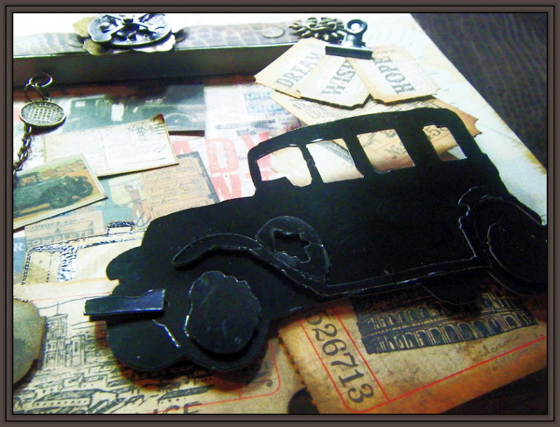
 Then I began on the backer, which is a goodly piece of cardboard, nice and chunky, as befits a recipe of this sort... Can't keep away from this fab paint / pva glue / paint sandwich crackle technique... It never fails to keep me amused and satisfied - little things eh??!!   This adorable ickle pocket watch charm was made to make time fly with the help of a pair of wings from Sir Tim's largest papillon ...

 The large clock was painted with a mixture of pool and denim, as before, with the addition of blue patina from the Eco range, so it is quite shiny and glossy... This picture also shows up the ripped card which comprises the "tide"... it tore VERY satisfyingly - is that a proper adverb?? - leaving a great white core showing for the waves...

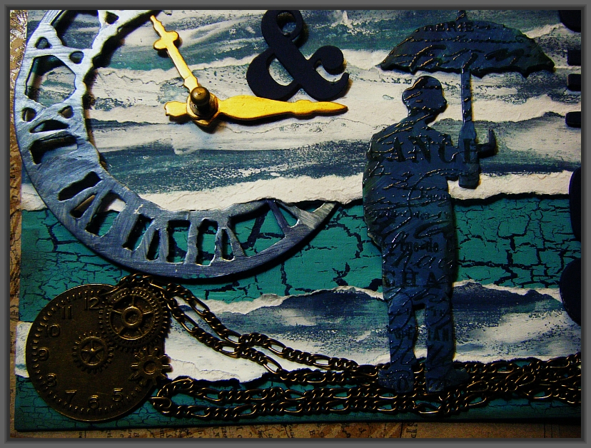
 And here is umbrella man - tada!! Not sure if I have used him before?? He seems to get everywhere... I contemplated cutting off his umbrella, but that seemed really unkind, bless... He is stamped in vintage photo, using the papillon backing sheet, and embossed in clear ep - well that's a technique she rarely uses eh??!!!

 This is another of my wonderful, newly acquired steampunk clocks, with some chain linked to it, to suggest sand / pebbles on the beach, but it is also under the man's feet, chaining him to time - OMG, where does she get it from?? that's very esoteric, and not a little pretentious my girl!!! move on please...

The whole thing is full of texture, colour and movement... I made it in a very short time, for me... probably just short of 2 hours... that's because the whole thing was fully there in my head, whereas I am usually adding and changing, and making it up as I go along. What about you, how do you do your creations I wonder??

So there you have it. I am very pleased with the way it turned out and I think it fits both challenges very well - modest with it too, ain't she!!??  For those of you still here, a gold star my friends, and the news that my ickle bug won't actually go away, even after three days of the antibiotics... should have gone to the doc sooner I hear the fragrant Freddie cry!!! too true.. However, my head is a lot clearer and I have stopped shaking and being sick, and the other!! Just the cough, which has settled in to annoy me!!!

Off to try to sleep now,  trouble is I start coughing as soon as I try to lie down!!  Anyway... enough... hope to see lots of you here, having a look, and leaving your wonderfully encouraging comments, which I greatly appreciate. Please pop along to both challenges and have a go - prizes and prestige await you!!!
Love and light
Frankie
xx

Friday, 6 May 2011

Stampman Challenge - Poppies

 Here we go with another great Stampman challenge... The lead is Janet and  Janet says

"Now onto this weeks challenge which is to use a POPPY in your creation. Here in Skipton the British Legion is very active and my Husband is organising a fund raising concert on the 25th October. He asked me a while ago if I thought I could get some cards together to sell at the concert and Jill and Ian have so kindly allowed us to have a Poppy challenge week to try and get some more cards together "

So, in answer to that maiden's prayer, tee hee, we are doing poppies, and Jill sent us a great selection of images as ideas... the DT has come up with some fabulous inspiration pieces, so why not pop over there and have a look. Join in to win a fabulous prize, whether you donate your card(s) or not... I used the Hero Arts engraved flower, which is a lovely image, and teamed it with a background made from a poppyhead stamp that I have forgotten where I got it from!!! Sorry...

 I have also cut some rosettes from red card and the black UTEE button was made from a mould around a TH accoutrement.  You can see the black poppyheads close up here. I adore this stamp and had not used it for such a long time... I stamped it first, then covered it wth clear ep. Then I smooched it with a mixture of distress inks in spiced marmalade, fired brick and barn door, with some adirondak red pepper. I oversparyed with a lovely perfect pearl mist from TH - I LOVE these as they add the mica without water, so they don't actually change your ink quality, just move it around a bit!! I then overstamped all over with Aspects of Design nature stamp, in spiced marmalade and clear ep-ed it.

 The Hero Arts flower was an image from Jill, so I smooched it in similar inks and clear ep-ed it. I then swiped it with the red pepper direct to paper... It is actually slightly more red and shiny than it seems here. I cut into the petals and stuck it so it is raised up a little more as you can see below...

I love the juxtaposition of the creamy, dull, TH kraft stash paper and the red and black of the images. The centre of the flower is finished with some pearly doodles in gold and black.. I have to admit, I took a long time to get to, and finish this one, what with poorly hands and lack of a bit of mojo about it... but I am now VERY pleased with the final effect. I don't think it would sell as a card for the event, so I will take some time to use the other images for that in the weeks to come.

I want to enter this piece into some other challenges
The Paper Variety - mists, paint etc
Bloggers Challenge - nature
Flourishes - flower
Dream Valley Challenges - flowers
Let's Ink it up - 3D flower
The Play Date Cafe - colours red/orange


Thanks for coming and looking and commenting. I really appreciate it. And to all my followers, I will be organising a "thingy" for you all very soon... don't know what yet, but it will be gudd!!!
Love and light
Frankie
xx

Friday, 8 April 2011

My Stampman DT Piece #20 and Grungy Monday #2

This piece is my design team entry at the Stampman challenge this fortnight... there are some wonderful pieces there, so why not have a look and join in??!! Neil is leading and has just joined our team and we are excited, cos he is so talented, so have a spy at his blog too... it's well worth it ... the link is there with his inspiration piece.

I am also entering this into the Grungy Monday challenge over at Studio L3 with the lovely Linda Ledbetter. For this, she asked us to base our piece on a video from Ranger for our edification!! Sir T!m showed us a different resist technique which I have tried here. I don't have any foamy stuff to make stamps yet, so I used a bought foam flourish stamp (can't remember where from) then swirled some vintage photo, spiced marmalade and such all over when the medium was dry... it showed up really well. So that's the background.

At the Stampman, the theme is embossing, so I decided to do dry and triple, just to be greedy. I whopped the musical folder through the bug - alas and alack my wonderful Vagabond is deceased... it is no more... it is an ex- machine!!! So it had to go back and there is no more stock yet... Opps, where was I???Oh yes, then I took a couple of alcohol inks plus gold, and dabbed like mad to fill in the indentations, followed by a generous swipe of archival black, to highlight (or should that be lowlight???!) the notes.

The triple embossing was done using clear UTEE, followed by several moonglow and distress eps, strategically placed to enhance the Aspect of Design botanical stamp. It's all finished off with a couple of pima flowers and a TH button, and a bookplate, in the coppery metal. The frame of the piece is made up of a few of the strips from the lost and found stash.

So there you have it... another much bigger piece, with a new-to-me technique, being the use of the medium to resist and a well loved one, which started me off in crafting in earnest, the triple embossing... Thanks for looking and please do leave a comment if you have time
Love and light
Frankie
xx

Friday, 25 March 2011

The Stampman Challenge #19 - Anything Tim - Lead DT Piece


Today, I am in the attic, with anything and everything (just about!!!) Tim... that's Sir Tim of Holtz, of course, in case you thought I meant my son!! I am so lucky that Jill, the Stampman, assigned this one to me, because it meant I could go to town and play with all my goodies... and SO good that I could use (NOT for the first time...) the Aspects of Design sheet 3, botanicals stamp that just matches the crowded attic paper from Sir Tim... I LOVE using my older goodies too!!! tee hee

So that was the thinking behind this piece, a picture of something you might find in the attic, and the old bircage used as a piece of storage for various bits and pieces. So that's where I started, after cutting it out, or rather causing it to be cut out, by my wonderful Vagabond. That beauty sure is saving my poor hands. I wanted it to look rusty and really old, so I set about it with various embossing powders, black soot and vintage photo from Sir Tim, and one called pewter, which gives things a shiny but gunmetal-dull appearance... hope that makes sense??

 I used the same ep's on the art letters. This is a technique that Tim showed us on the configurations day, and I love the look of type letters you can get. In the two pictures below, you can see the effects more clearly in close-up. The cage and the letters really do look metallic - embossing was the thing that got me into crafting in the first place... it's magic.  The lock in this looks great added to the cage, I think... almost as if there is a door.. . it has little holes on the side, so I could not resist putting a padlock and key on there for added interest...


 This lovely paper is from the crowded attic stash - oooo it's fabulous, but SO difficult to cut into... cos it's too full of loveliness!! There is only one of each sheet per pad, so I did not have another moth to decoupage. The Aspects of Design moth is actually perfect for this purpose. I stamped it on Claudine Hellmuth canvas, stuck on to a piece of cardstock. I used brown archival ink then made some texture lines with a thin pen.

 Below is a close up of the little danglers, hanging with the TH thin link chain. The vials contain tiny fasteners. The fawn clock on the left is a facet - the largest one in the set, and the clock face comes from the lost and found stickers pack... As I said, just about everything Tim!!!


 The large flowers are Prima... I would have LOVED to add one or two of the metal flowers Lin Brown of Yours Artfully makes, but can't do them yet, so that's for another time. The small ones are separated roses from the lavish trimmings set, sprayed with perfect pearl mist, colour that is SO subtle... I need the whole set!!

 I am so pleased with my crackle effect. I used some adirondak and eco acrylic paints in a pva glue sandwich. I then distressed it some more with the perfect pearl mist and a blue patina eco paint.


There we are. It is a very different piece for me, but I thoroughly enjoyed it and it has pride of place on my window sill. I shall do more of these larger pieces. Thanks for looking, and leaving your comments, I really appreciate them all. Don't forget to have a go at the challenge... you don't need to go mad with stuff like me!! The theme is Anything Tim....
Love and Light
Frankie
xx

Friday, 11 February 2011

Stampman Challenge - Hearts

As many of you know I am addicted to all things Sir Tim, as are many millions around the globe... it's only a couple of weeks now to his masterclass, and I am very much looking forward to it. This this in mind, I simply had to do something different this time for the Stampman challenge, HEARTS, so I melted black UTEE in my meltpot and poured it into a largish heart mould. Then I decorated with mica powders and the cogs, sprockets, spinners and keys etc. as you can see, and mounted it on bronge coloured metallic card popped through the cuttlebug... had a GREAT time, but was a little late posting - sorry team, had an odd, poorly, hosptially week this week with myself, Freddie and Jayden all being ill...  The piece is just for fun, so thanks for looking
Love and Light
Frankie
xx

Friday, 28 January 2011

Stampman Challenge - Oriental


Here is my DT piece for this new Stampman challenge... Its a reworking of a card I made some time ago, but loved and I wanted to try it in different media... so I have used Claudine Hellmuth canvas (my new fave stuff!!) and promarkers to colour the lady. Where I used bamboo before, this time I used a fab pagoda... pity I can't take a straight photo!!! Why not pop over and have a go, it's a great challenge with super prizes...

Thanks for looking
Love and light
Frankie
xx

Friday, 14 January 2011

Stampman Challenge - Distress

Here is a distressed, shabby mini album project, made from C6 envelopes, cut down. I thoroughly enjoyed doing this album, and using many lovely, yummy papers and flowers. I have entered it as my DT piece for the Stampman challenge this time, so why not go over and have a look and a go yourself??!

I made these roses which were introduced to me by Jo from Jozarty. The other flowers are conflations of different types and makes. I made these beads too, and the charms and keys, etc are from Sir Tim.

These hearts above and below, are oozed friendly plastic through angelina fibres... it's a great technique to try.


This is the first page, using papers from a Sir Tim stash, which really matches the colour scheme of my wedding/handfasting. You will notice a tag down the centre here, and on every page in fact. These tags are the hinges of the book.
At the side of each page is the pocket made from the envelope. I have pictures with journaling in each pocket, decorated with flowers.
These other papers are wonderfully evocative and are from PaperArtsy... fabulously yummy!!


Below is another good view of the tag hinges down the centre, holding the pages together. You can use almost any shape here, but a tag seemed most appropriate to match the feeling of the album.


This is the back cover, made from a sheet of coloured sticky back canvas from Claudine Helmuth. It was coloured with colour washes and stairburst stains, similarly to one of the tags of Christmas from Sir Tim. The two hearts are made from friendly plastic, pulled apart whilst hot and sticky, to create the lacey effect. I used the hinges and keys from Sir Tim's alteration dies.

I love thumbing through this album and have already started on another one, using different papers and with a different purpose. I shall put some inspirational sayings in it, in the various psockets, and consult it when I need to... you got any favourites to leave me here??? If so, please leave them in your comment, I will be most grateful

Thanks for looking and reading so far!!
Love and Light
Frankie
xx